soulati.com

Digital Marketing Strategy, PR and Messaging

  • Home
  • So What is Message Mapping ?
  • Services
  • Hire Me
  • Blog
  • Presentations
  • Get a FREE E-Book
  • Contact
  • Home
  • So What is Message Mapping ?
  • Services
  • Hire Me
  • Blog
  • Presentations
  • Get a FREE E-Book
  • Contact

Soulati-'TUDE!

Prediction: Web Browsers Will Control The World

03/14/2013 By Jayme Soulati

English: Browser usage share on Wikimedia Foun...

English: Browser usage share on Wikimedia Foundation projects on June 2011. (Photo credit: Wikipedia)

How’s your browser? No, I didn’t say bowser.

I’m talking about Mozilla (not gorilla) Firefox, Google Chrome, Microsoft Internet Explorer, Safari, and other steroidal and hormonal necessities of online life as we know it.

From the sounds of it, we can jump into a chrome fox mobile and explore while on a hot safari.

I don’t know about you, but I’m a wee bit tired of the issues with browsers of late:

  • Google and Java don’t like each other.
  • Heck, Firefox and Java don’t get along, either.
  • Java and Shockwave interfere with Facebook.
  • Chrome doesn’t work with my webinar hosting platform.
  • Firefox is the best blog publishing browser, but there are glitches with Chrome.
  • Browser plug-ins? Fuhgeddaboudit. Don’t try them; stay basic.
  • Chrome is for anything else.
  • Safari is just for Apple.
  • Internet Explorer? Uhmm, who uses that?
  • Mac and Windows are arch enemies; that’s why I have to run both side by side with one browser for one OS and another browser for the other…or some such.

Get my drift?

My prediction: Web browsers will control the world; heck, they already do. (Not you hackers.)

I will cry harder because my work product productivity is seriously suffering already. Every day. I wish I was born an IT guru; the problem is my mom loved to read, so she probably read me books on creativity while I was nesting in her belly.

Back to our African safari…let’s throw in the food. The only thing I know for sure is to eat your cookies and clear your dough, I mean cache.

Clear your cache every two to three days and your browser should work fine.  At least, that’s what all IT support tells me.


Related articles
  • The Origin of Web Browsers!
  • How To Disable Java In Your Web Browser
  • John Pavley: May the Web Browser Rest in Peace
  • No Firefox web browser for iPhone or iPad unless Apple relaxes its rules
  • Clear the Internet Cache for Different Browsers
  • Why I’m switching (back) to Firefox
Enhanced by Zemanta

Filed Under: Technology Tagged With: Apple, Firefox, Google Chrome, Internet Explorer, Java, Mozilla, Safari, Web browser

Responsive Design Primer For Bloggers

01/16/2013 By Jayme Soulati

Pleased today to welcome and She is a most amazing member of this community and our Bloggers Unite! Google+ community, may I say, who has a thirst for learning I rarely see. Please welcome her and her writings with a warm hello in comments with your input and questions.

wordpressSUSAN SILVER SAYS:

, also called mobile design, is a must for anyone with a website or blog. I am on this band wagon and have been slowly teaching myself some skills over the past year. Like many freelancers, the idea of hiring a designer is not in my budget at the moment. That is why I want to share a primer for others wanting to take the DIY approach.

I’ll start by explaining some of the terms you are likely to encounter and then give you some resources for further research.

Responsive Design Vocabulary

HTML5 – HTML is the structural foundation for a website or blog. It is the deeply embedded code that tells a browser how to render a document. HTML5 adds more ways to display content on various devices with native video and audio options.

CSS3 – CSS stands for cascading style sheets. We can make all sorts of changes to the superficial aspects of our website without having to change any of the structure. It’s just like painting the walls of your home. The only thing that changes is what is on the outside. You don’t have to touch the wires or insulation. CSS3 adds new rules for how these sheets behave.

Responsive or Fluid Grids– Responsive grids are generated by CSS code. They are what make responsive design possible. The designer creates rules for how “boxes” on the screen should behave on different devices. When you change the browser window size these boxes will move their position or disappear dynamically.

Jquery Plugin- These plugins are not like WordPress plugins. They have this name because they can be added plug-in-play style to a design. In general, you upload a java script file (.js) into a directory. You then insert a line of code into your designs that calls on that script and runs it.

Icon Font– Icon fonts are very useful for responsive design. This is because they are not image files. To make an image responsive requires a lot of work. With an icon font you can treat what would have been an image the same way as text, which is much easier to manipulate. is a great example of what you can do.

Framework or Boilerplate – There are a slew of these roaming around. They have names like “”, “” and “” (to name the most popular). There are also a few that are only responsive grids like “”. These are skeletons that you can build on that are prepped for responsive design. It takes the hassle out of starting new projects.

Starting with Responsive Design

Well, you probably are not feeling too pleased right now with the idea of doing something yourself. Many of these terms might be new. I won’t lie to you, I was pretty scared myself when I started.

The first thing I did on my journey was to start following the top design blogs. I listened to the discussions that developers were having about using HTML5 and CSS3. In these arguments it became clear what was really important to know and what was over my head.

Use these links to start your journey learning design and development.

  • – Weekly Roundup of Design Resources


Related articles
  • Fluidity – A Modern CSS3 And HTML5 Framework For Node.js/Stylus
  • 16 Useful Responsive CSS Frameworks And Boilerplates
  • 50 Fresh Resources and Tools for Inspired Web Design
  • How to Use Any Font You Like With CSS3
  • jQuery/HTML 5 Slides Plugins To Help You With Presentations – 18 Items
  • CSS Grid Systems Make You Look Good and Your Client Happy
  • Separation, Abstraction, and Cascading in CSS
  • Responsive Slideshow Photo Gallery Grid with Html5

Filed Under: Technology Tagged With: Cascading Style Sheets, CSS, Data Formats, Google+, HTML, HTML5, Twitter, Twitter Bootstrap

Why Responsive Design Is A Must in 2013

01/03/2013 By Jayme Soulati

Like the new digs? Open up on your smart device and see why responsive design for your website is a critical must have in 2013. What’s the stat? Oodles of peeps use smartphones and mobile devices to surf the net, and it’s only getting higher. (How’s thCalculateat for exact data to encourage your transition?)

There are websites that look good on a tablet; however, when you begin scrolling and navigating, the site really isn’t built for the small screen of an iPhone.

Going responsive means a few things:

  1. Your masthead has to fit snugly within the width of a smart device (regardless of its size). When someone logs in to the website, the masthead has to look normal; when they log in to a smart device, the masthead scales to fit and also pops on that smaller screen.
  2. The sidebar is invisible on a smart device. With a responsive theme on WordPress, the calls to action and badges and radio buttons stack up in the middle of the screen.  On the desktop, they appear off to the right as usual.
  3. Careful thinking has to be incorporated into a responsive theme. When designing a website in a content management system like WordPress with a custom theme or existing skin or template, you toss up the sidebar without a worry.  With a responsive approach, ordering of calls to action and what goes on the sidebar are mission critical.
  4. You need to engage with a developer who knows what the heck he or she is doing. There is way too much back-end tech required to push the engine of a website. Code is required for anything you do; a content marketer or social media pro cannot ever master all that code.
  5. You do need to understand what goes on behind the scenes of a website. Even when you’re publishing in content management systems and what you see visually on the dashboard is what appears live, the code is right there.
  6. Don’t get left in the cold; get your site responsive so when people begin to surf your site will feel more welcome than the other clunkier site with poor navigation and tremendously obnoxious scrolling.

Websites should always be updating; tweaks to sidebar, refresh of design/color and plug ins, navigation and share bars or comment systems. These are things most bloggers can update on their own, and should.

Afraid of tech like me? Embrace your fears and get your fingers dirty; that way you can better direct the show from the stage instead of in the wings.


Related articles
  • Content Marketers Need Web Designers And Developers
  • 10 Web design trends you can expect to see in 2013
  • Web Design: 20 Hottest Trends To Watch Out For in 2013
  • 30 Top Rated News & Magazine Style WordPress Themes for 2013
Enhanced by Zemanta

Filed Under: Blogging 101, Technology Tagged With: responsive design, smart phone, website design, website publishing

The Future of Blogging Is Mobile Technology

10/03/2012 By Jayme Soulati

This is post #351; how cool is that?

The future of blogging is mobile technology AND motivated bloggers, that’s my add. This week, I took Mark Schaefer’s blog post about dim lights ahead for bloggers with little that’s new and added my perspective. Read Mark’s post there; read my post here.

In comments, the community heard from both Mark Schaefer and Danny Brown. Each weighed in to put some more insight to what’s around the bend for bloggers.

What they said is too valuable not to make into a post:

Mark suggested he purposely kept his post about what’s new in blogging (July 2012) a bit thin to prompt conversation and chatter about the direction we’re all going. What he clarified in comments on the blog yesterday was more on the influence of mobile technology on blogs.

Mark proffered, “ As smartphones increasingly become our first step to the Internet, the utility of our blogs is eroding day by day. Our beloved medium is becoming harder to read, harder to engage with and less useful – and writing better blog posts won’t change that.”

What he also alluded to is mobile platforms remove the bells and whistles from a blog’s appearance. When people use smartphones and tablets to read a blog, all the widgets and plug-ins in the sidebar disappear. Who we are becomes next to invisible when mobile technology is used.

Enter Danny Brown.

Danny shared fabulous tips in comments I’ll paraphrase and quote:

  • Bloggers are lazy and short-changing their audience.
  • Bloggers have no reason not to be mobile for readers’ convenience and at minimal cost.

“Free platforms like Blogger and WordPress.com already offer great mobile-friendly and mobile-optimized designs, and if you’re on self-hosted WordPress, plugins like WPtouch Pro offer a great solution, too,” said Danny in comments.

“Yet, the best one – and very inexpensive – is a true, responsive design. This adapts your site or blog to whatever browser your visitor comes in on, so it’s not just optimized for mobile for older browsers and different displays.

You can grab a responsive design package from the likes of Studiopress and their Genesis framework and child themes for as little as $80.

If you’re serious about your blog and your readers, go responsive. Don’t look to blogging’s future as being at stake – think about you as a blogger, and your responsibility to user experience,” he concluded.

Responsive Design

According to Wikipedia responsive design is “an approach to web design in which a designer intends to provide an optimal viewing experience—easy reading and navigation with a minimum of resizing, panning, and scrolling—across a wide range of devices (from desktop computer monitors to mobile phones).”

If you’re really a geek, you may want to try and read the rest of the page after sentence one; I couldn’t make heads or tails about it, but it certainly becomes the question to ask designers of websites and blogs.

Do you do responsive design?

About That Technology

Mark Schaefer will tell you what a scaredy cat I was back in the day when I insisted on tweeting instead of blogging – for a whole year! Mark would try to convince me, and I’d cringe about the technology.

I still hate it because I’ve not mastered it. The things you hear me whine loudest about are the things I fear – big data, analytics, technology, and my new iMac.

Deploy New Plug-ins

What the leaders are saying is for a blogger to grow to the next level, technology is the answer. Go get WPTouch or WPTouch Pro:

From Brave New Code on the plug-in: WPTouch (lifted exactly)

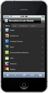
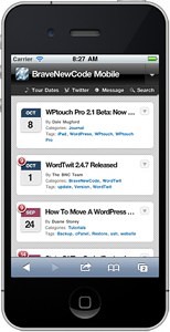
WPTouch automatically transforms your WordPress website into an application-like theme, complete with ajax loading articles and effects when viewed from the most popular mobile web browsing devices like the iPhone, iPod touch, Android mobile devices, Palm Pre/Pixi and BlackBerry OS6 mobile devices.

The admin panel allows you to customize many aspects of its appearance, and deliver a fast, user-friendly and stylish version of your site to touch mobile visitors, without modifying a single bit of code (or affecting) your regular desktop theme.

The theme also includes the ability for visitors to switch between WPtouch view and your site’s regular theme.

Now Available: WPtouch Pro! Totally re-written top to bottom, with a slew of new features like more style, color and branding customizations, themes, 10 languages, more advertising options, Web-Application mode, and more!

Awesome iPad theme support is now available in WPtouch Pro, now at version 2.7!

So, to wrap it up — run and get some new mobile-type plug-ins for your blog; we have to or else Mr. Brown is going to keep calling us lazy critters!

Credit: Brave New World WP Touch


Filed Under: Blogging 101, Technology Tagged With: blog plug-ins, blog technology, Danny Brown, future of blogging, Mark W. Schaefer, Plug Ins, WPTouch

8 Tips To Migrate From Feedburner to Feedblitz

09/14/2012 By Jayme Soulati

Credit: Feedblitz.com

There’s one thing that’s dead for sure — Feedburner, without a doubt. One day this week, Feedburner stopped sending my blog to Triberr and anywhere else. My blog was dead, too, because no subscribers or RSS feeds were getting my material.

Why? Because Google  bought Feedburner for $100 million in 2007 and shut it down.

As a blogger concerned with the front end and nice words you see on these pages, I didn’t pay attention to the hubbub surrounding Feedburner…until I was forced to pay attention.

I am proud to say that all by my lonesome I migrated with one simple ebook that appeared miraculously in my email box and I downloaded immediately — The Feedburner Migration Guide. 

If you follow this book, page by page with its excellent screen shots and simple, plain English instructions, you will be able to do this in about four to five hours. Now, mind you, this blog has no traction when it comes to a database, subscribers or even an RSS feed. In fact, I’m not even sure what I’d put in an RSS feed beyond my blog posts or how that gets populated.

If your blog has hundreds of well-earned subscribers, you’re probably going to want to ensure  you interact with Feedblitz tech support, and they are very helpful. I emailed a question to a general email box, and they got back to me after fixing my mistake and even looking at my blog.

Here are a few tips to make your migration smoother:

1. Uncover your log in and password to Feedburner; this is the first thing you’ll need.

2. Do not delete the feed from Feedburner unless you’re done setting up Feedblitz first.

3. Use the ebook and nothing else to guide you and follow the steps. I can’t say I understood everything in it; I just extrapolated the sections that I knew pertained to my use of RSS, and it worked. The screen shots are wonderful.

4. Don’t forget to go into your widgets and click on RSS. Change the feed source url to Feedblitz.

5. Download the Feedblitz plug in and activate it AFTER you delete the Feedburner plug in.

6. Write a quick test post and see if it appears on sites where your posts are republished, like Triberr and Social Media Today and Alltop, for example.

7. Go to someone’s blog like  or Craig McBreen who have CommentLuv and see if your test post is picked up.

8. Don’t forget to add your new Feedblitz source feed url to all the sites/settings where you re-publish your blog — see 6 above.

If you have any questions, don’t ask me by any stretch! Use the book and the fabulous support desk at Feedblitz.

Here’s one more disclaimer, I have no idea how to use 1/4 of the solutions and options Feedblitz offers, but people have to learn somehow, right? I can’t tell you whether this is the best option for your blog, but just went there and if he migrated all of his subscribers, well you can, too.


Filed Under: Blogging 101, Technology Tagged With: Feedblitz, Feedburner, RSS

« Previous Page
ALT="Jayme Soulati"

Message Mapping is My Secret Sauce to Position Your Business with Customers!

Book a Call Now!
Free ebook

We listen, exchange ideas, execute, measure, and tweak as we go and grow.

Categories

Archives

Search this site

I'm a featured publisher in Shareaholic's Content Channels
Social Media Today Contributor
Proud 12 Most Writer

© 2010-2019. Soulati Media, Inc. All rights reserved. Dayton, Ohio, 45459 | 937.312.1363